The Context Gap Between Screen and Sky
Most billboard ads aren’t failing because of bad ideas—they’re failing because of bad context. Designers often create visuals on crisp 15-inch screens in controlled lighting, only to have those same designs hoisted 50 feet into the air, battling sunlight, distance, and motion. The result? Ads that looked sharp in the studio become washed-out, unreadable blurs in the real world.
If you’ve ever driven past a highway unipole and couldn’t make out the message, you’ve witnessed this disconnect firsthand. In this article, we’ll unpack why this happens, reveal a simple but powerful design “hack,” and walk through practical ways to make your billboard ads visible, legible, and effective—even from 500 meters away.
You’ll learn how environmental factors affect visibility, why color contrast matters more than creativity in outdoor advertising, and how to design specifically for large-format displays that live in bright, unpredictable conditions.
Designing for Distance, Speed, and Light
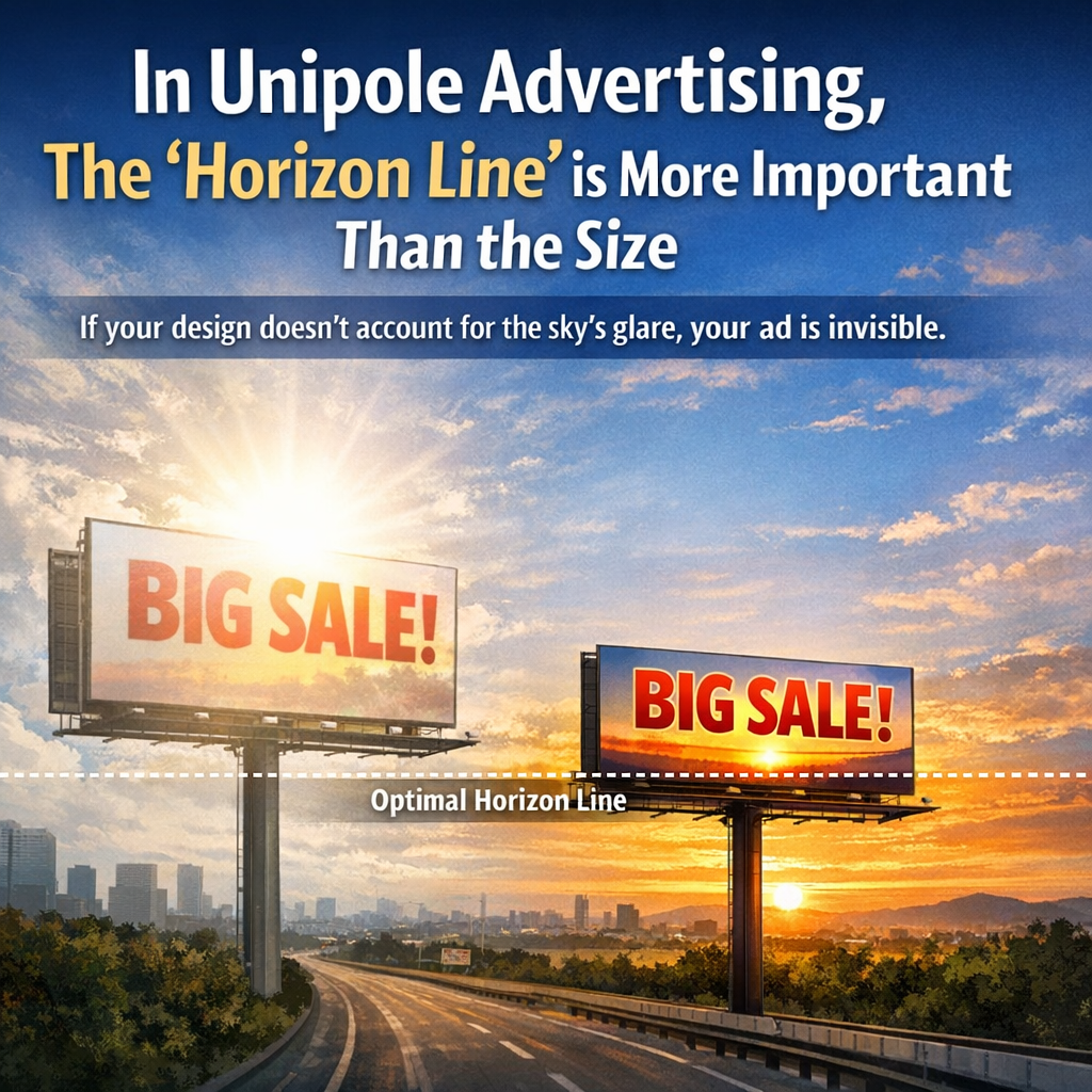
Designing for a unipole is fundamentally different from designing for a screen. On a laptop, your audience is close, stationary, and viewing in controlled lighting. On a highway, your audience is moving fast, glancing briefly, and looking up into a bright sky.
This shift introduces three major challenges: distance, speed, and lighting. At 50 feet high and hundreds of meters away, fine details disappear. Thin fonts, subtle gradients, and low-contrast color combinations become nearly invisible. Add in the sun—especially against a bright blue or white sky—and you get glare that further reduces readability.
Real-world example: A retail brand once used a clean, minimalist white billboard with light gray text to look “premium.” On the designer’s screen, it looked elegant. On the highway, it looked blank. Drivers couldn’t distinguish the message because the sunlight washed out the already low-contrast design.
This is the core issue: billboard design isn’t just about aesthetics—it’s about physics and perception.
[Suggested visual: Side-by-side comparison of a billboard design on a laptop vs. how it appears outdoors in bright sunlight]
Why White Backgrounds Fail Outdoors
White backgrounds are one of the most common mistakes in unipole advertising. On screens, white provides a clean canvas. Outdoors, it becomes a reflector.
When sunlight hits a white billboard, it reflects a large amount of light back toward viewers. This reflection reduces contrast, making text and images harder to distinguish. Even dark text can lose clarity if the surrounding brightness is too intense.
Think of it like trying to read your phone screen in direct sunlight without increasing brightness—it becomes difficult, even if the content itself is well-designed.
Now scale that problem up to a massive billboard, viewed from a distance, at speed, and often at an angle. The result is a washed-out message that fails to communicate.
In contrast, darker, high-saturation backgrounds absorb more light and create stronger contrast with text and graphics. This makes them far more effective in outdoor environments.
[Suggested visual: Diagram showing how light reflects off white vs. dark surfaces]
The High-Contrast Color Solution
Here’s the simple but powerful fix: use high-saturation, darker colors to create a silhouette effect against the sky.
Colors like deep blue, red, and black work exceptionally well because they provide strong contrast and resist washout. When paired with bold, light-colored text (like white or yellow), they create a visual that “pops” even from long distances.
This approach works because it leverages contrast, not complexity. The human eye is naturally drawn to high-contrast elements, especially in bright environments. A dark background with bright text creates a clear visual hierarchy that can be processed quickly—critical for drivers who only have a few seconds to glance at your ad.
Case study: A roadside campaign switched from a white background with black text to a deep navy background with white text and a red accent. The result was a measurable increase in recall and engagement, simply because the message became readable at greater distances.
The key takeaway is that visibility beats subtlety. If people can’t read your message, nothing else matters.
[Suggested visual: Before-and-after billboard designs using white vs. high-saturation backgrounds]
Designing for Real-World Visibility
To create effective unipole ads, you need to design with distance and motion in mind from the start. Here’s a simple process you can follow:
Start by simplifying your message. Limit your content to a few words—ideally under seven. The goal is instant comprehension, not detailed explanation.
Next, choose a high-contrast color palette. Pair dark, saturated backgrounds with bright, bold text. Avoid pastel tones, gradients, and low-contrast combinations.
Then, scale your typography aggressively. What looks “too big” on your screen is often just right on a billboard. Use thick, bold fonts and avoid thin or decorative typefaces.
After that, test your design. Zoom out on your screen until the design is very small—this simulates distance. If you can’t read it easily, neither can your audience.
Finally, consider environmental context. Is the billboard facing the sun during peak hours? Is it set against a bright sky or a cluttered urban background? Adjust your colors and contrast accordingly.
This process helps ensure your design performs in the real world, not just on your laptop.
[Suggested visual: Step-by-step design checklist or flowchart]
If you’re working on unipole or highway advertising, a few practical habits can dramatically improve your results.
Always design with the final environment in mind. Mock up your billboard against a sky background rather than a white artboard. This simple shift can reveal contrast issues early.
Use bold color blocking instead of detailed imagery. Complex visuals often get lost at distance, while simple shapes and strong colors remain clear.
Test under different lighting conditions. What works in a dim office may fail in direct sunlight.
Prioritize readability over branding nuances. A perfectly on-brand but unreadable ad is ineffective.
Work with real-world scale whenever possible. Viewing your design at actual size—or a close simulation—can highlight issues that aren’t obvious on a small screen.
[Suggested formatting: A short bullet list summarizing “Do vs. Don’t” design choices for quick reference]
Designing for highway unipoles isn’t just about creativity—it’s about understanding how people see, move, and process information in real-world conditions. The biggest mistake designers make is forgetting that their work will live outdoors, not on a laptop.
The solution is surprisingly simple: prioritize contrast, use high-saturation colors, and design for visibility at distance. Avoid white backgrounds that reflect sunlight and wash out your message. Instead, create bold, high-contrast visuals that stand out against the sky.
When you shift your mindset from “how it looks on screen” to “how it performs in the environment,” your designs become not just attractive—but effective.
The next time you create a billboard, step outside—literally or mentally—and design for the world your audience actually sees.
For those interested in exploring this topic further, consider looking into research on visual perception and contrast sensitivity in outdoor advertising.
Industry resources such as the Outdoor Advertising Association of America (OAAA) provide guidelines and best practices for billboard design.
Books on environmental graphic design and wayfinding can also offer valuable insights into how people process visual information in large-scale spaces.
Studying successful billboard campaigns in your area can be equally instructive—pay attention to which ones you can read instantly, even at high speed.